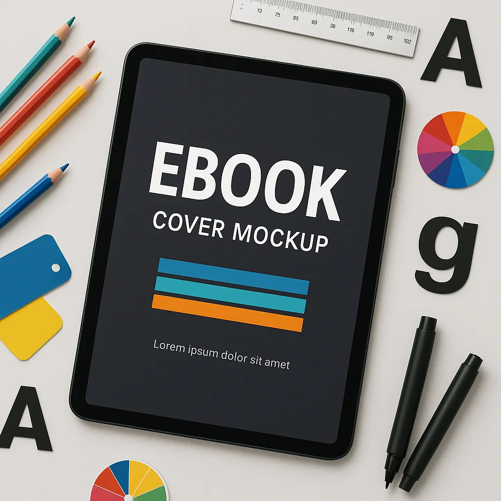
Top Ebook Cover Design Tips to Make Your Book Stand Out
In today’s digital marketplace, your ebook cover is often the very first thing potential readers see. A compelling and professional cover can mean the difference between a book that gets noticed and one that gets passed over. Ebook covers are not just packaging—they’re powerful marketing tools that influence reader decisions in seconds.
This article will guide you through essential ebook cover design tips to help your book catch eyes and boost sales. From understanding the role of cover design to practical advice and common pitfalls, you’ll learn how to create a cover that truly stands out.
Understanding the Role of Ebook Cover Design
The First Impression Factor
When browsing online bookstores or apps, readers make snap judgments based largely on cover appearance. Your ebook cover is your handshake—professional, inviting, and intriguing covers increase the chances readers will click to learn more. A strong first impression can hook a reader before the description or reviews come into play.
How Covers Affect Perceived Genre and Quality
Effective ebook covers communicate genre instantly. Whether it’s a cozy mystery, a romance novel, or a sci-fi thriller, readers rely on visual cues to match their preferences. Additionally, a polished cover signals quality and professionalism, helping to build trust. Conversely, a poorly designed or amateurish cover can make readers doubt the book’s content, even if it’s excellent.
Cover Design vs. Content: Why Both Matter
While content is king, even the best writing can go unnoticed without the right packaging. Your cover complements your story and sets expectations. Investing in a strong cover design is investing in your book’s success—it’s the gateway that invites readers inside your work.
Key Elements of an Effective Ebook Cover
Title and Author Name Placement
Clear, well-placed titles and author names are crucial. The title should be the most prominent element, easily readable at thumbnail size. The author’s name should support the title without competing for attention unless you have strong brand recognition. Centered or slightly offset titles often work well, depending on the overall design.
Typography Choices: Readability and Style
Typography sets the tone and mood of your book. Choose fonts that reflect your genre—serif fonts for literary fiction, bold sans-serifs for thrillers, or handwritten styles for romance. Most importantly, ensure readability. Avoid overly decorative fonts that become illegible when shrunk to thumbnail size.
Color Schemes and Their Psychological Impact
Colors evoke emotions and can hint at your book’s atmosphere. Warm tones like reds and oranges often suggest passion or danger, while blues and greens can imply calm or fantasy. Consider color psychology but also make sure your chosen palette contrasts well to keep text and key elements visible.
Imagery and Graphics: Choosing the Right Visuals
Images should support the book’s theme without cluttering the cover. Whether you use illustrations, photographs, or abstract graphics, opt for visuals that resonate with your target audience. Avoid clichés unless you can present them in a fresh way. Subtle, meaningful imagery can create intrigue and convey your story’s essence.
Consistency with Genre Expectations
Readers subconsciously look for genre signals. Make sure your cover aligns with common visual themes in your book’s category to meet reader expectations. For example, a fantasy novel might feature mystical elements and dramatic typography, while a self-help ebook often uses clean lines and calming colors.
Practical Design Tips to Make Your Ebook Cover Stand Out
Keep It Simple and Clear
Simplicity is powerful. Crowded covers confuse the eye and dilute your message. Focus on one or two key elements—like a bold title and a striking image—and eliminate distractions. Minimalist designs often have more impact, especially in thumbnail view.
Use High-Quality Images and Graphics
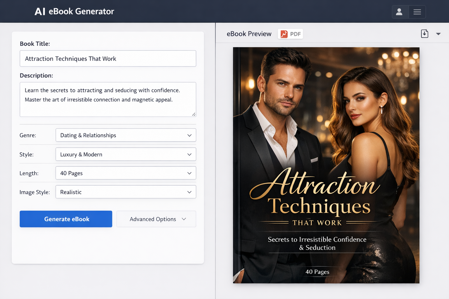
Pixelated or blurry images scream “amateur.” Use high-resolution graphics that look sharp on all devices. Platforms like Makeebook provide resources and templates that help maintain image quality while streamlining the design process.
Optimize for Thumbnail Viewing
Remember that most people will see your cover as a small thumbnail on a device. Test your design at small sizes to ensure the title remains readable and the cover stays visually appealing. Simplify details and increase contrast to enhance visibility in tiny formats.
Incorporate Branding Elements
If you’re a series author or have an established brand, include consistent design elements such as color schemes, fonts, or logos. This builds recognition and trust over time. Even standalone ebooks can benefit from subtle branding cues that tie your works together.
Test Different Designs with Your Target Audience
Gather feedback from your ideal readers before finalizing your cover. Use polls on social media, author forums, or beta readers to see which design resonates best. Constructive feedback can reveal overlooked issues and improve your cover’s effectiveness.
Tools and Resources for Ebook Cover Design
Popular Design Software (Canva, Adobe Photoshop, etc.)
For DIY authors, tools like Canva offer user-friendly drag-and-drop interfaces with pre-made templates tailored for ebook covers. Adobe Photoshop and Illustrator provide more advanced options for those comfortable with graphic design. These tools allow you to create professional, custom covers without needing extensive experience.
Hiring Professional Designers vs. DIY
While DIY design is affordable and empowering, sometimes hiring a professional designer is worth the investment, especially if you want a unique and polished look. Professional designers understand genre conventions, typography, and composition to create covers that sell. Platforms like Fiverr or 99designs can connect you with freelance designers at various price points.
Stock Photo and Graphic Resources
High-quality stock images and graphics can enhance your design. Sites like Unsplash, Pixabay, and Shutterstock offer vast libraries of royalty-free images. Be sure to check licensing agreements to avoid legal issues. Combining stock resources with your own creativity can produce standout covers.
Common Mistakes to Avoid in Ebook Cover Design
Overcrowding the Cover
Packing too many elements into your cover creates visual confusion. Avoid layering multiple images, excessive text, or numerous decorative elements. A clean, focused design is more memorable and effective.
Using Too Many Fonts or Colors
Stick to two or three fonts max, and a coherent color palette. Mixing too many styles can look chaotic and unprofessional. Consistency in typography and color helps unify your cover.
Ignoring Genre Conventions
While originality is important, completely ignoring genre expectations can mislead or alienate your target audience. Research successful covers in your category and adapt ideas rather than reinventing the wheel.
Poor Image Quality or Resolution
Never sacrifice image quality. Low-resolution or stretched images reduce credibility and deter buyers. Ensure all elements are crisp and clear at multiple sizes.
Case Studies: Successful Ebook Covers and What You Can Learn
Example 1: How Minimalism Worked
A bestselling self-help ebook used a simple white background with a bold, black title and a single icon representing growth. The minimalist style conveyed clarity and professionalism, making the book appear trustworthy and approachable.
Example 2: Bold Typography and Color Use
A thriller novel’s cover featured large, sans-serif typography in bright red against a dark background. The stark contrast and aggressive font style immediately communicated tension and suspense, attracting fans of the genre.
Example 3: Genre-Specific Design Approaches
A fantasy ebook cover incorporated mystical symbols, ornate fonts, and a rich color palette of deep blues and golds. This design aligned perfectly with reader expectations, enhancing appeal within the fantasy community.
Conclusion
Creating an ebook cover that stands out requires thoughtful design and attention to detail. Prioritize clarity, genre alignment, and quality images while keeping your design simple and readable. Test your cover with your audience and don’t hesitate to invest in professional help if needed. Remember, your cover is your first and best chance to attract readers—make it count.
Platforms like Makeebook can simplify this process by providing templates and tools tailored to ebook designers, helping you produce polished covers faster.
With the right cover, you increase your book’s visibility, build trust with readers, and ultimately boost sales. Take the time to craft a cover that truly represents your story and invites readers to dive in.
Call to Action
Have you designed an ebook cover before? What challenges or successes did you experience? Share your stories or questions in the comments below—we’d love to hear from you!
For more tips on book marketing and design, subscribe to our newsletter and stay updated with the latest strategies to help your ebooks shine.